The odyssey of building Fluent UI for Svelte
Most web-based desktop apps look like disguised web pages: plasticky UIs, zero accessibility, and nothing native about them. I wanted real Microsoft Fluent 2 in my Tauri and Svelte apps, but nothing out there cut it. So I walked right into the lion's den and built it myself.
Published: October 15, 2026 - Updated: October 16, 2026
Author: Jorge Acosta
Reading Time: 9mins
It all started with a very specific frustration...
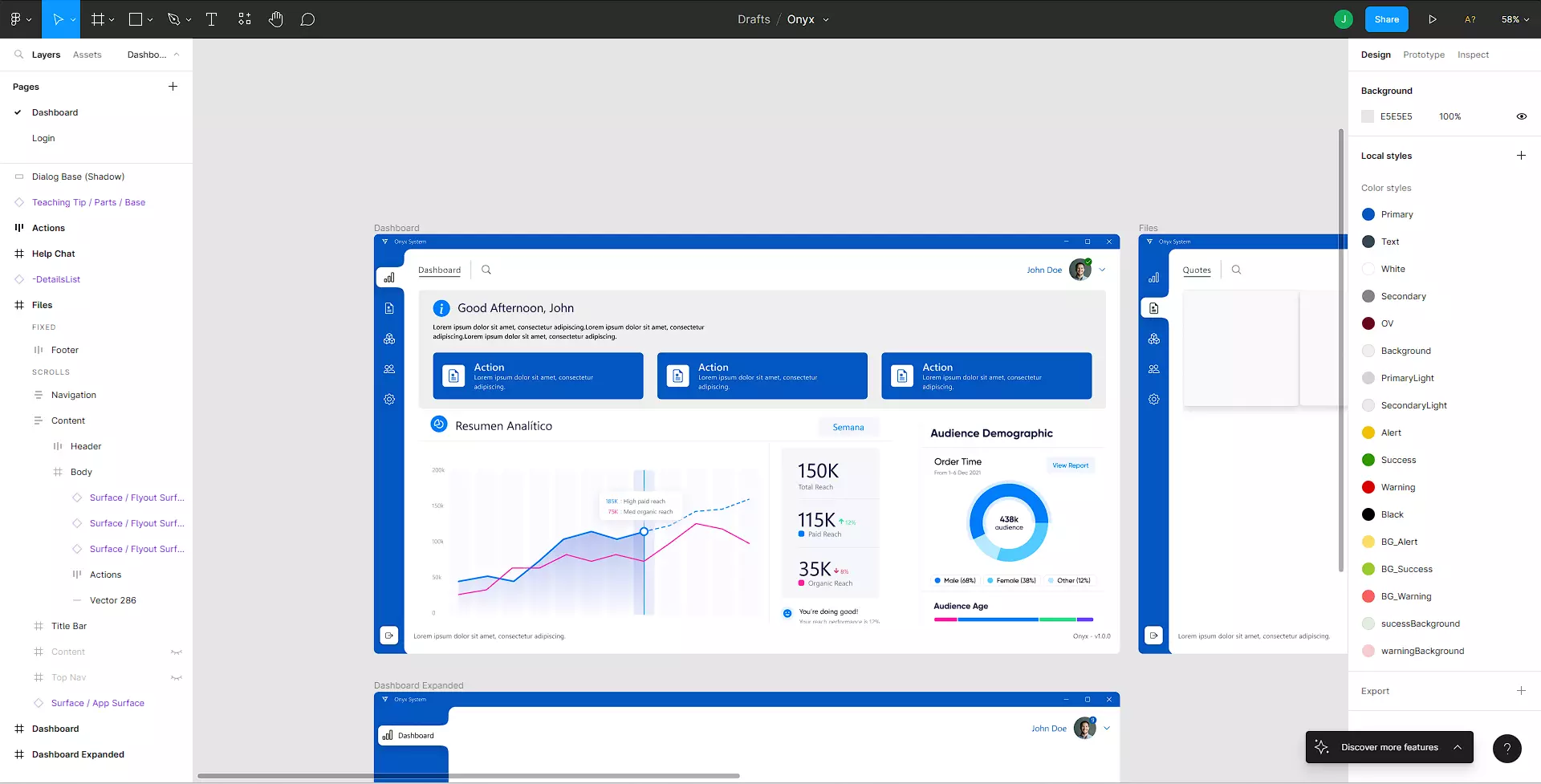
I was designing and building cross-platform desktop applications using Tauri (and evaluating Electron) with Svelte. The promise of these technologies is incredible, but there was one huge problem: the user interface.
If you look at most desktop apps built with web technologies out there, you can tell from a mile away that they are just disguised web pages.
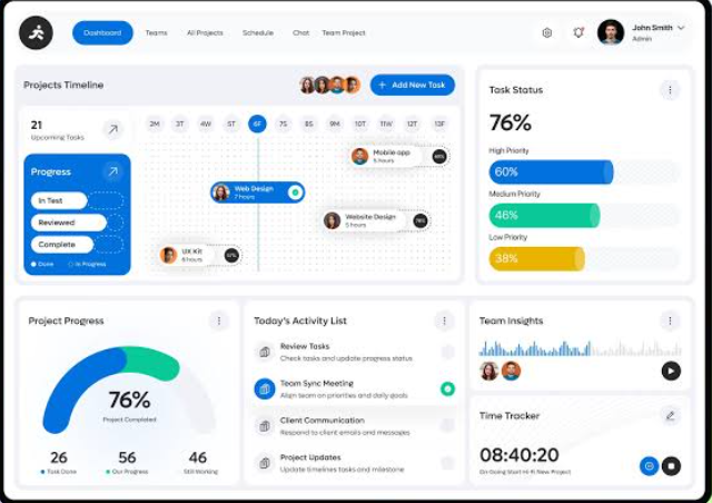
They are full of weird interfaces that don't respect OS conventions, have zero accessibility (try using them with just your keyboard and you'll suffer), and, being honest, they are often visually ugly or feel "plasticky".
I didn't want that. I wanted my Windows and desktop apps to look, feel, and behave like an authentic Microsoft application (Microsoft, if you're reading this, I'm not trying to... impersonate/steal/infringe/pass off as/or whatever fancy legal term your lawyers come up with... misuse your brand, it's just that FluentUI/WinUI is awesome!). I wanted the clean aesthetic, the layers, the precision... basically everything FluentUI 2 offers. (But damn, is it complex!)
Just recently I was chatting with folks from the Svelte maintainers team. And honestly... What a fantastic chat. Conversations about
A11y, the right way to categorize components without tangling them up with business logic... A bit of a debate aboutAI... I think I should do this more often 😁😁 It really helped reaffirm my stance ona11yandfluentui
The fruitless search and the documentation labyrinth
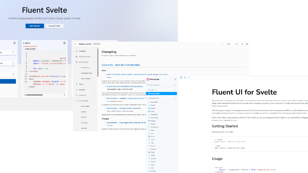
I thought: "Surely someone has already solved this for Svelte". I searched all over GitHub and npm. I found projects abandoned years ago on Svelte 3 (which I actually ended up using in a Midu.dev Hackathon a long time ago, though I didn't win 🥲), incomplete Web Component wrappers that weighed a ton, or libraries that vaguely imitated the old Windows 10 style (Metro/Fluent 1) with no soul and zero maintenance.
If I wanted real Fluent 2 in Svelte, I had to build it myself. 😣
And that's where the real headache began: deciphering Microsoft's official documentation.
Understanding Fluent UI at an engineering level is like walking into the lion's den
You have design specs in Figma, documentation scattered across Fluent 2 Web, WinUI 3, and the monstrous @fluentui/react-components repository. And they all say different things for the exact same component! They even have different names across each documentation.
I spent weeks reverse-engineering: dissecting how Microsoft calculates every color token, the layering, how they handle animation curves, and what exact padding and border-radius sizes make a button or an input feel "native" to Windows 11 rather than a cheap Bootstrap clone (no offense hahaha).
What started as "I just need a few components for my Tauri app" turned into months of sweat, sleepless nights, and hundreds of hours invested. That's how FluentUI Svelte was born.
Currently, the project is in v0.6 (Beta). It works like a charm in production, though there is still plenty to polish and add. But before reaching v1.0, I want to share the real complexity of what lies under the hood.
1. True integration: Thinking in Svelte, not React
Translating the mental architecture of React (where Microsoft's official Fluent UI lives) to Svelte was the first big wall. In React, everything revolves around hooks, heavy contexts, and virtual renders. Porting that literally to Svelte would have been an insult to the compiler. And you can actually find attempts at doing that out there.
I rewrote every pattern from scratch so it would feel 100% native:
- Reactivity: Leveraging the power of Runes (
$state,$derived,$effect) so that each component's state is surgical. In a desktop app (Tauri/Electron), 60fps smoothness is non-negotiable. - Clean composition with Snippets and TypeScript: No obscure configurations. I wanted strict typing and IDE autocomplete to tell you exactly what to do the moment you import a component, without having to stay glued to the documentation. (Still needs a few touches 😅)
- Simplifying FluentUI's Layering: If you look into how the UI works, you'll realize they use a layer-stacking philosophy (Layering) where the combination of each layer results in the visual effect we all know. It was especially challenging, and here goes a secret that's no longer a secret: I tried building FluentUI/WinUI over 6 years ago. Back then, it was impossible to recreate the effects with pure CSS without resorting to the then-recent (2020) implementation of CSS Houdini, so I scrapped it.
- Opinionated vs. Unopinionated components: Nowadays, almost all libraries are designed to be "headless" or customizable down to their guts right inside your repository. While that's often great, that philosophy doesn't fit well when you literally want your UI to strictly be FluentUI, Material Design, or maybe LiquidGlass. Sometimes you just want to grab a component, tell it what happens when the user interacts with it, and not worry about
a11y,contrast, or anything other than "what does this button do when clicked"—and maybe slap an icon on it. (Don't get me wrong, in many cases having that low-level control in your repo is an excellent idea). But withfluentui-svelte, I wanted to absorb all that design and accessibility complexity for you... You just take care of "what the component does".
2. Accessibility (a11y): What separates a toy from a professional tool
One of my biggest gripes with the "pretty" UI libraries flooding the web is that they completely ignore accessibility. In a real desktop application, power users live on the keyboard: they use Tab, Shift+Tab, Escape, arrow keys, and Enter purely out of muscle memory.
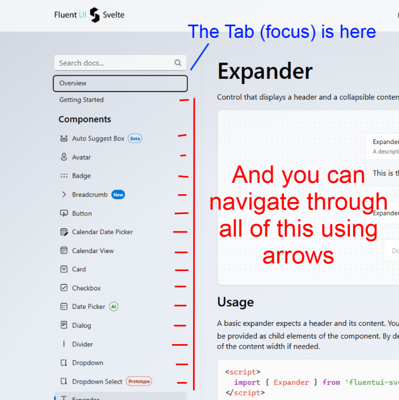
This is where over 60% of the development time went:
- Real keyboard navigation (Roving Tabindex & Focus Trap): Visually building a
Dialog, aMenu, orTabstakes a couple of hours. Making sure focus stays trapped inside a modal, returns to the exact button that triggered it upon closing, or ensuring arrow keys cycle through items while skipping disabled ones... that takes days of trial and error. Microsoft has a library for this calledtabster... But to find out why I didn't use it to buildfluentui-svelte, stay tuned for:TabSpot: from madness to salvation. - Frictionless WAI-ARIA: Automatic management of roles,
aria-expanded,aria-selected,aria-controls, and screen reader support so that accessibility comes out of the box, not as an optional "afterthought". - Microsoft-style Focus Visible: Exact implementation of Fluent's high-contrast focus ring, which only appears when navigating via keyboard (
:focus-visible) and doesn't clutter the UI when clicking with a mouse.
3. Pushing CSS to the limit: Squeezing the latest platform features
To make an interface feel native without clogging the main JavaScript thread with style calculations, I went all-in on modern CSS.
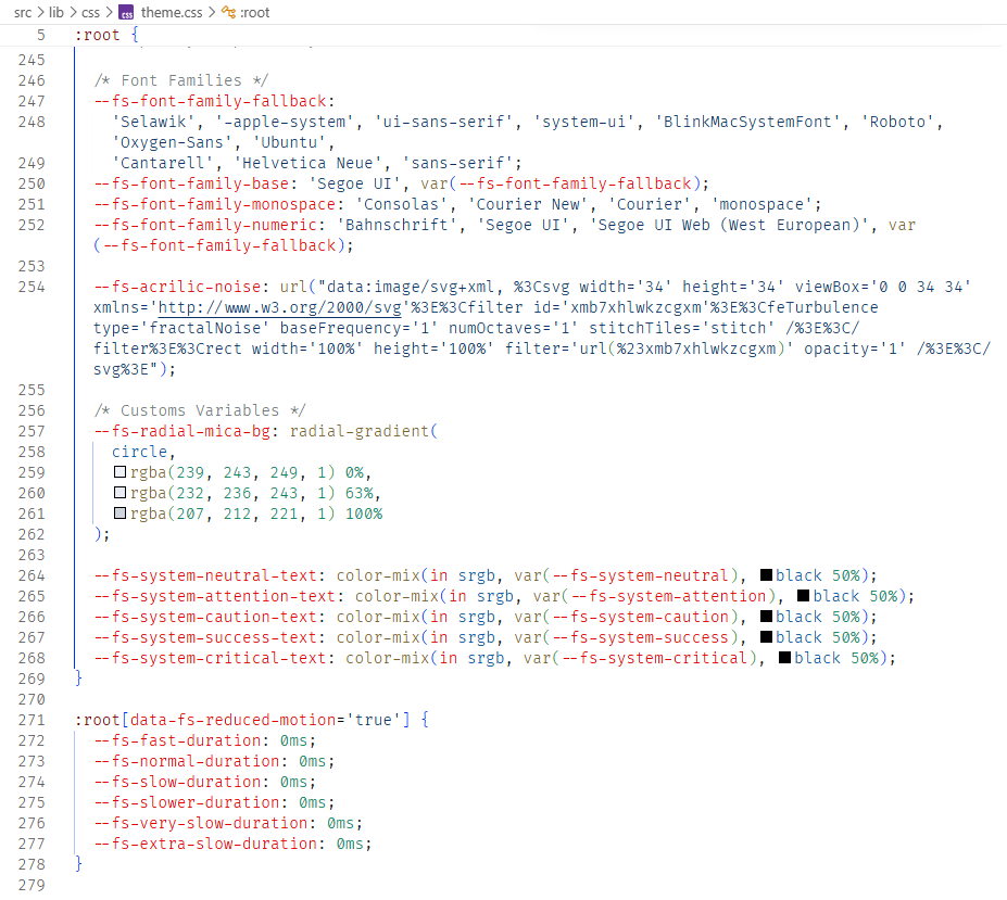
- The Fluent 2 Token System: I mapped Microsoft's entire Design Tokens architecture to CSS Custom Properties. Surfaces, neutral backgrounds, brand colors, elevation shadows, and deceleration curves. Switching between light and dark mode is instantaneous.
- Next-gen selectors (
:has(),:is(),:where()): Thanks to:has(), parent containers can react to the state of their children (for instance, changing the border of an entire wrapper when the inner<input>is focused or in an error state) with zero lines of JavaScript. And with:where(), I keep specificity low so you never have to fight styles using!important. (Still working on this :v ) - Modern CSS and native APIs: Extensive use of CSS Nesting, dynamic color functions, and leveraging modern browser capabilities (like the updated Webviews in Tauri/Edge WebView2) to achieve ultra-lightweight transitions and positioning. Plus
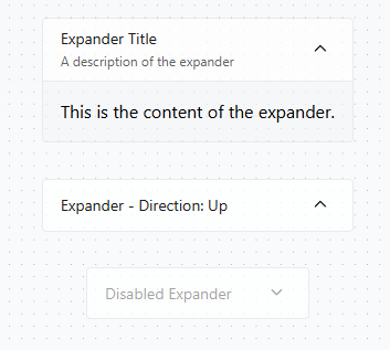
color-mix,field-sizing: content,mask,backdrop-filter, and several others. Well... the only component in the entire library that uses a Polyfill is theExpander(and I'll be removing it soon).
4. Documentation, CI/CD, and the birth of Propsmith
Nobody uses a library they don't know how to integrate. Building fluentui-svelte.pages.dev/docs was practically developing a second project in parallel.
And right here, I ran into a classic maintenance nightmare: type duplication.
If I changed a prop in a Svelte component or updated a TypeScript interface, I had to manually go to the documentation to update the prop tables, default values, and descriptions. Doing this two or three times for each of the dozens of components wasn't just exhausting—it was a guaranteed recipe for outdated docs.
Building my own tool: Propsmith
Since I didn't want to spend my life rewriting the same thing three times, I had to pause and figure out a way to build another open-source tool from scratch: Propsmith.
Propsmith is a type extractor designed to read source code and TypeScript definitions directly, extract props, types, default values, and comments, and transform them into structured data ready to be consumed by the documentation.
Building a type extractor has its own dark magic (dealing with ASTs, complex types, unions, and inherited interfaces is pretty tricky), but once fine-tuned, it works like a charm.
This:
/** @propsmith Button */
export type ButtonProps = {
  /** The visual size of the button. */
  size?: Sizes;

  /** Whether the button is disabled. @default false */
  disabled?: boolean;

  /**
   * Visual style of the button.
   * @deprecated Use `variant` instead.
   */
  appearance?: string;
};

export type Sizes = "small" | "medium" | "large";
Turns into this:
| Name             | Type                       | Default | Description                                                        |
| ---------------- | -------------------------- | ------- | ------------------------------------------------------------------ |
| `size`           | `"small"` | `"large"` |         | The visual size of the button.                                     |
| `disabled`       | `boolean`                  | `false` | Whether the button is disabled.                                    |
| ~~`appearance`~~ | `string`                   |         | Visual style of the button. **Deprecated:** Use `variant` instead. |
Now, the source code is the single source of truth:
- I write or modify the component and its types just once.
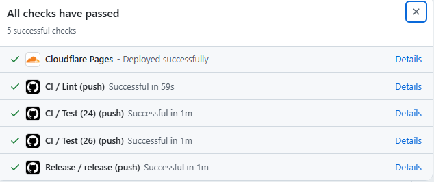
- In the CI/CD pipeline, Propsmith kicks in automatically and extracts all the prop metadata.
- Static validations (
svelte-check) and packaging for Vite/SvelteKit run, and everything gets deployed to Cloudflare Pages with the documentation always 100% in sync with the latest commit.
5. The road to v1.0 (and how you can join in)
Reaching v0.6 has been a brutal marathon (and the 32 new issues will definitely keep me busy). Today, I can use FluentUI Svelte in my own projects and feel that pride of seeing a Windows application that looks like it came straight out of the design labs in Redmond, with the featherweight footprint and speed of Svelte.
But a design system is never truly "finished". There are still bugs to hunt down, accessibility edge cases to perfect, and new components waiting in the queue.
If you've ever felt that same frustration when building apps in Svelte or Tauri/Electron, I invite you to give it a spin:
- Explore the project: on GitHub
- Check out the documentation: Official Site
- See the roadmap and Issues: Milestone v1
Whether you use it in your next app, open an issue when something breaks, or feel like sending a PR, welcome aboard. Let's give applications built with Svelte the professional-grade interface they deserve.
PS: I just opened my GitHub Sponsors account! If it's within your means to support me with a donation, I would appreciate it immensely! My GitHub Sponsors Here

I build products for the web, experiment with ideas, and document what I learn along the way. This blog is my personal notebook of projects, tools, interfaces, and everything I discover while trying to create better experiences. Some posts come from real problems I’ve faced while building, others come from simple curiosity and the desire to understand how things work.
Have something you want to build? Tell me about your idea — maybe we can create something interesting together.